The meaning of the wallpaper color
The meaning of wallpaper color goes beyond aesthetics—it influences mood, behavior, and even physical reactions. Choosing the right color for your space can enhance comfort, energy, and emotional well-being.
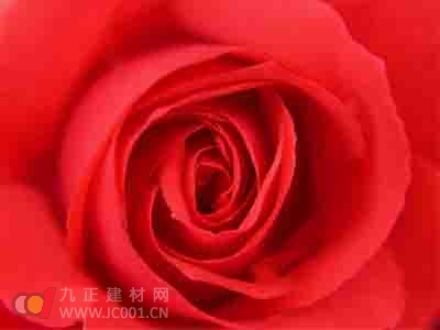
Red is a powerful and intense color that evokes strong emotions. It can increase heart rate and blood pressure, making it ideal for spaces where energy and passion are desired, such as restaurants or dining areas. In Chinese culture, red is also associated with good luck and celebration, making it a popular choice in traditional settings.
Orange is a warm and inviting color that strikes a balance between red and yellow. It brings a sense of friendliness and approachability without being overwhelming. Orange is great for living rooms, family spaces, and children's bedrooms, creating a cozy and welcoming atmosphere.
Yellow is known for its brightness and positivity. It can energize a space and draw attention, which is why it’s often used as an accent in offices or kitchens. However, too much yellow can be overstimulating, especially for young children, babies, or the elderly, so it should be used carefully.
Green is the color of nature and peace. Light greens create a refreshing and calming environment, perfect for bathrooms or living areas. Darker shades of green can add depth and sophistication to kitchens or dining spaces. Due to its calming properties, green is commonly used in hospitals, schools, and work environments to promote focus and relaxation.
Blue is associated with calmness and serenity. It’s an excellent choice for bedrooms, helping to promote restful sleep. However, blue can also suppress appetite, which is why it’s not typically recommended for dining areas. Its cool and soothing effect makes it suitable for both adults and children’s rooms.
Purple is a unique and creative color that blends the energy of red with the calm of blue. It’s often favored by children but may not appeal to all adults. Purple walls in a child’s room or play area can spark imagination and creativity, making it a fun and vibrant choice.
Twilight, a soft blend of blue and purple, offers a subtle and sophisticated tone. It’s popular among older generations for its calming and mature feel. While it adds elegance to a room, it’s best used in small amounts rather than as a dominant color. It works well in government offices or professional spaces to convey a sense of authority and refinement.
The workshop is a place to stand and work for long periods of time, so the use of anti-fatigue MATS is very important for the health and productivity of employees. The following is a discussion about the necessity of using anti-fatigue MATS in the workshop and the types of options available on the market: anti-fatigue floor MATS combine various functions: fatigue relief, high elasticity, shock resistance, etc., can effectively prevent impact and fatal injuries, and are very durable for industrial and harsh environments. The shape of its bottom and surface is designed for workers to stand for a long time, which can greatly reduce the fatigue and pain caused by prolonged standing on the legs.
Anti Fatigue Mats Industrial,anti fatigue mats,fatigue mats,anti fatigue floor mats,anti fatigue kitchen runner
Jiangyin Yining E-Commerce Co., Ltd , https://www.pvcmatyining.com